January 15, 2025

Florida is the Florida of ballot-design mistakes

Well designed ballot layouts allow voters to make their intentions clear; badly designed ballots invite voters to make mistakes.  This year, the Florida Senate race may be decided by a misleading ballot layout—a layout that violated the ballot design recommendations of the Election Assistance Commission.

In Miami Palm Beach, Florida in the year 2000, the badly designed “butterfly ballot” misled over 2000 voters who intended to vote for Al Gore, to throw away their vote.  (That’s a strong statement, but it’s backed up by peer-reviewed scientific analysis.)

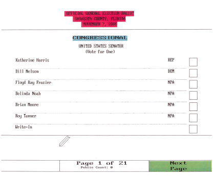
In Sarasota, Florida in the year 2006, in a Congressional race decided by 369 votes, over 18,000 voters failed to vote in that race, almost certainly because of a badly designed touch-screen ballot layout.

In Broward County, Florida in the year 2018, it appears that a bad optical-scan ballot design caused over 26,000 voters to miss voting in the Senate race, where the margin of victory (as of this writing, not yet final) is 12,562 votes.

Back in 2000, many Miami voters wishing to vote for the second candidate down the left-hand side, punched the second hole down; that hole was officially a vote for right-wing candidate Pat Buchanan.
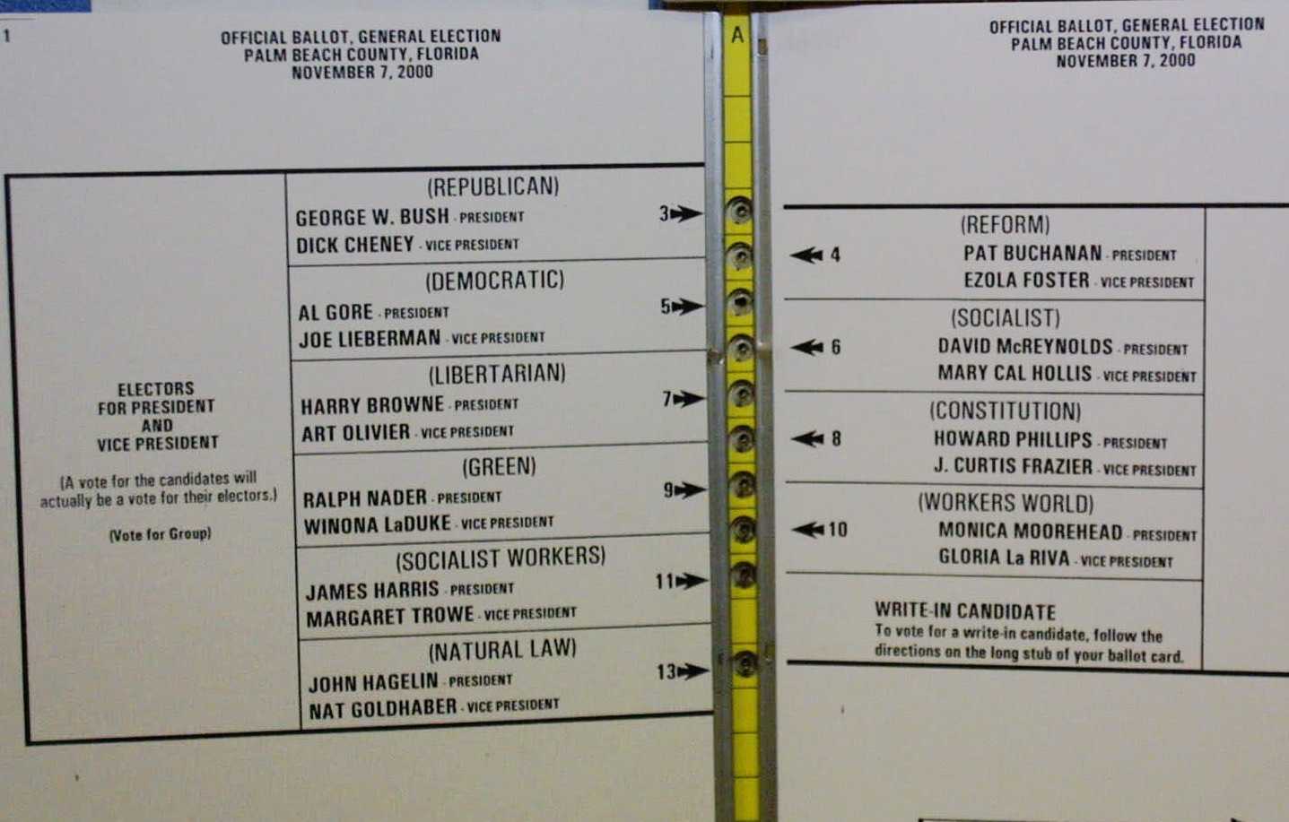
(Although the butterfly ballot got all the attention, other ballot-design flaws in Florida 2000 in five other counties probably caused 6700 lost presidential votes as well, according to Professor Douglas W. Jones of the University of Iowa.)

Back in 2006, the Sarasota touch-screen machines showed one contest per page, like this:
But on one of the pages, two different contests were listed:
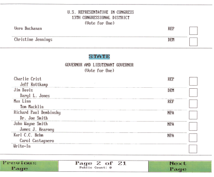
At top there is the 2-candidate race between Vern Buchanan (REP) and Christine Jennings (DEM), and at bottom there is a 6-candidate race for Governor.  The bottom race is more prominent in two ways: it occupies more space, and it has a boldface, blue-background heading, STATE.  You might think, “I’d never miss that!” and there’s an 86% chance that you’re right, which is to say, about 14.9% of the voters did undervote in the top race, where the normal undervote rate for congressional races is about 1.2%.

From this fiasco came a very simple principle of touch-screen ballot design: if you’re going to put only one contest per page, then stick to only one contest per page!  And perhaps, don’t let voters move to the next page if there’s an undervote on this page, unless they indicate in a positive way that they wish to undervote.

The 2018 Senate race in Broward County

This year in Broward County, the optical-scan ballot looks like this.  The race for Senate is hidden in plain sight at bottom left, just under the instructions in English, the instructions in Spanish, and the instructions in Creole.  Those of you who don’t read Creole very fluently might stop reading at that point, and skip to the top of the middle column.  In that case, you’d be in danger of undervoting in the Senate race.
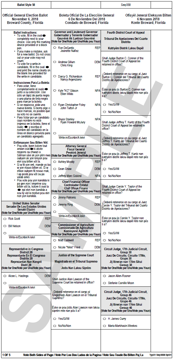
The most official stylebook in the United States for designing optical-scan ballots is the 2007 publication of the Election Assistance Commission, Effective Designs for the Administration of Federal Elections, Section 3: Optical scan ballots.

The EAC’s publication uses this ballot as an example:
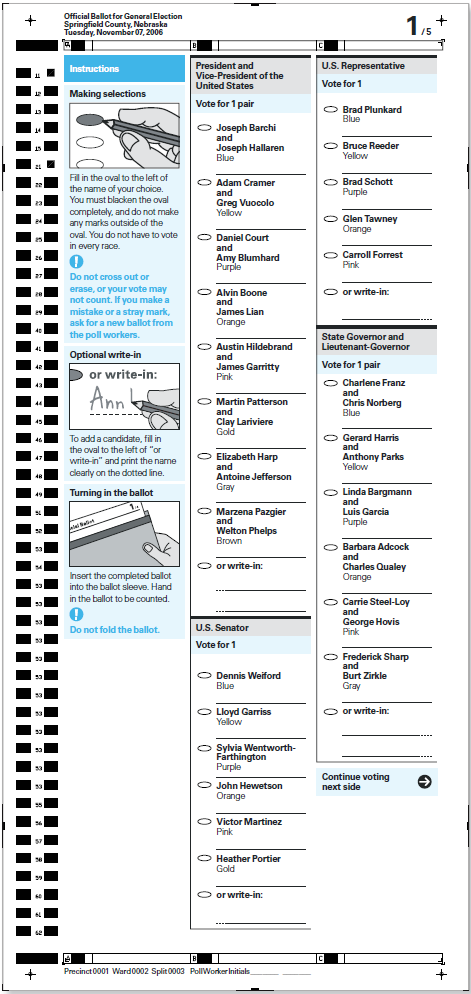
The Broward ballot violates these EAC guidelines:

  • §3.11 “Ballot instructions, running either vertically or horizontally, must be self-contained and separated from contest data. Vertical instruction treatments cannot share column space with contests—test voters often overlooked races located immediately beneath vertical instructions.”   This is the smoking gun.  The Broward County Supervisor of Elections, Brenda Snipes, did not follow simple and clear guidelines from an Election Assistance Commission document that must surely be required reading for anyone in this country designing optical-scan ballots.
  • §3.3  “Use one language per ballot . . . display no more than two languages simultaneously.” This made a difference! note that in neighboring Miami, where the op-scan ballot displayed shorter instructions in only two languages, with the first contest starting below that in the first column, there were far fewer undervotes.
  • §3.11 “apply color only to instructions.”    The EAC ballot’s instruction block has a light blue background, whereas Broward’s instruction background-fill was the same as the contests.

By the way, if you’re not sure which party those 26,000 voters might have intended to vote for in the Senate race, look again at Broward ballot.  In the race right below the Senate race, one party didn’t even nominate a candidate to run in that Congressional district.

Comments

  1. Celeste Bush says

    It was Palm Beach County that had the bad butterfly ballot in 2000. Not Miami Dade.

  2. I can’t get passed the butterfly ballot before; feeling the need to comment. What “peer-reviewed scientific analysis” really determined that people voting for Pat Buchanan really intended to vote for Al Gore? The link talks about “Palm Beach County has the most anomalous excess of votes for him.” Of course the link only links to an article that summarizes a JStore study behind a paywall… yet again I am not allowed to actually see what “scientists” do before they make their claims.

    What I did note, is that they DIDN’T say that they actually called the citizens of Palm Beach County; and asked if they did indeed intend to vote for Al Gore. It isn’t really an anomaly for one county to vote different than neighboring counties. Where I live, that is why the gerrymanderous (if I might make up a word) GOP split my county up; so that the Democrats wouldn’t have any power despite it clear that my county generally votes democrat in the reddest state of the nation.

    I look at the butterfly ballot; and I don’t see any problem with anyone who knows how to read arrows (any kindergartner can follow the arrows). I suspect then; that the claims of voters intentions being not understood was false; and the “study” just as false.

    Okay, before hitting Post Comment, I did read through the rest; and even the other comments. I agree with Douglas W. Jones on the point about having a vote one; with two separate columns giving people the idea that they should vote both of those columns even in the same race… causing an overvote. That is a design flaw; but the second example shows an undervote. I undervote for a lot of races (because my county clerk unilaterally decided to not allow write-ins) where I can’t in good conscience vote for any candidate. Again, anyone who can’t understand two headings for wo different races; shouldn’t be voting; that is different than two headings for the same race though.

    Finally, the columns. Perhaps it is just because I am a type-setter of newsletters where writing in columns is a standard thing. Reading in columns is also a standard. This year my ballot was exactly the same kind of thing; the instructions at the top left column; there was two races below that same column; how can anyone miss that. Some races on my ballot even slip columns, but they didn’t duplicate instructions; but again I know how to read in column format; not a design problem; with an educated public anyway; so long as there is not a duplicate of instructions. Maybe their are policies to keep the instructions in its own column; but really that shouldn’t be called a design flaw.

  3. Corrected Douglas W. Jones link: http://cs.uiowa.edu/~jones/voting/cogel/

  4. So, the bottom line is that the problem rests solely on the shoulders of Brenda Snipes, who, after years in office and despite the extremely clear guidance cited, simply can’t figure out how to get a basic ballot design correct? Seems simple to how to fix this problem.

  5. Brad Wilson says

    If you are unable to understand the examples above you should not be voting.

  6. Great analysis and excellent additional analysis by Douglas Jones. The two of you should get together and write a quick Op-Ed for the Wall Street Journal or NYT Sunday edition.

  7. Douglas W. Jones says

    Back in 2002, I did a preliminary analysis of ballot design problems in Florida, and presented the results here:
    http://http.cs.uiowa.edu/~jones/voting/cogel/

    The recounts in Florida in 2000 gave us an unparalleled natural experiment. There were large numbers of counties voting on optical-scan paper ballots, and I was able to collect sample ballots for most of them. Here are some highlights of what I found:

    — The overvote rate on counties that used precinct count scanners varied from under 0.1% percent to over 3%t, but only 4 counties had rates over 1%, Columbia (over 3%) where, apparently, pollworkers were instructed to press the override button if ballots were kicked back, and Escambia (over 3%) and Manatee (just over 1%), where the second chance option was disabled in the election setup. The Orlando Sentinel, May 6, 2001 reported this issue in an article entitled “New system fumbles votes.”

    — Over 275,000 ballots were counted using ES&S M150 and M550 central count scanners. The overvote rates varied from 3.4% to 11%. Because there were 11 presidential candidates, the race didn’t fit at the bottom of the first column. Most counties using this system split the race, printing the first 7 or 8 candidates at the bottom of column 1 and the remaining 3 or 4 at the top of column 3. Each rectangular box of candidates was helpfully marked with instructions inviting a vote so a literalist could read the instructions as requiring an overvote! Lake County (92,000 ballots) figured out how to format the ballot so the presidential race was not split into two columns. Their overvote rate was under 3.4%. On counties that used 2-columns for the presidential race, the average overvote race was over 6%, varying from 4.2% Suwannee County to over 11% in Gadsden County. A crude estimate suggests that breaking the race into 2 columns probably cost about 4700 voters their presidential vote.

    — The “vote for 1” instruction used on normal one-person races seems wrong in a vote for president and vice president, so Florida adopted the strange instruction “vote for group” statewide. Looking at those 2-column ballots discussed above, 10 counties used the “vote for group” instruction on each box of presidential candidates, while Charlotte and Liberty counties thoughtfully changed the instructions to “vote for one group”. The overvote rate in the “vote for group” ballots averaged 7.4%, while the rate fell to 4.3% with the addition of the word “one”. A crude estimate suggests that omitting the word “one” cost on the order of 3000 voters their presidential vote. (Lake County also added the word “one” but they had a one-column ballot, so I don’t include them here.)

    — Over 1,386,000 voters used Global Accuvote “fill in the bubble” precinct-count scanners. The instructions on these scanners can be broadly divided into those where the example bubbles in the instructions were placed to the left of the instructions, in the same way as the real bubbles were placed relative to candidates, and those where the bubbles were simply dropped into the text, generally toward the right of the bulk of the instructions. In the newspaper-run unofficial recounts, one of the interesting statistics that was gathered was the rate at which voters “invented” their own bubbles by drawing and then filling bubbles to cast votes. In counties where the example bubbles were to the left of the text, like real ones, the rate of invented targets was 0.006%; in counties with bubbles printed in the flow of the text, the rate of invented targets was 0.09%, dominated by St. Lucie County, where the rate was over 0.3%. Given the number of ballots involved, this is a very small effect, probably only accounting for 70 lost presidential votes.

    Note, the wide spread within some of the groups suggests that there were other variables at work, and I didn’t look at them. I didn’t look at the demographics of the counties, I just looked at per-ballot statistics.

    There’s probably room for a PhD thesis here for someone who wants to do a really careful look at the ballot design issues explored by the Florida 2000 “natural experiment”.

  8. Here’s what ballot papers look like in Australia. Federal, state and local council ballot papers (yes, they are paper) look similar, no matter where you vote.
    https://www.aec.gov.au/Voting/How_to_vote/practice/
    Just for comparison.

  9. In every example shown, the republican candidate was listed first. Why?

    • James Redekop says

      The incumbents in all of those cases are Republicans, so it may just be that incumbents are listed first.

      • bill nelson is the incumbent in the florida 2018 senate race, but he’s listed second.

      • It is listed that way because the Governor of state is that party. Republican Governor. All races begin with Republicans first and visa versa

    • I believe the parties either rotate or draw lots for placement. I’m in a heavily Republican county but all races had the Democratic party first this go-around.